What did we measure?
Ever tried to negotiate where to sit at a concert with a friend who thinks it’s much louder up front than you do? Or wondered how cars are rated loud or quiet? What was it about what you heard, or didn’t hear, that you noticed? Standard measurement methods are key to being able to describe and make comparisons accurately across different listening experiences.
This project recorded underwater sound continuously throughout the day and night at 30 locations in the U.S. National Marine Sanctuary System over three years. This effort resulted in a very large amount of information. In fact, this project generated 300 terabytes of data. For context, approximately 500 hours’ worth of movies can fit in one terabyte. Information of this size is hard to share and hard to make sense of. To support sharing, all the project’s raw data are archived and accessible from the NOAA National Centers for Environmental Information (NCEI) Passive Acoustic Archive. To support understanding, the project extracted standard measurements from these recordings, which are also archived at NCEI and made accessible via ERDDAP.
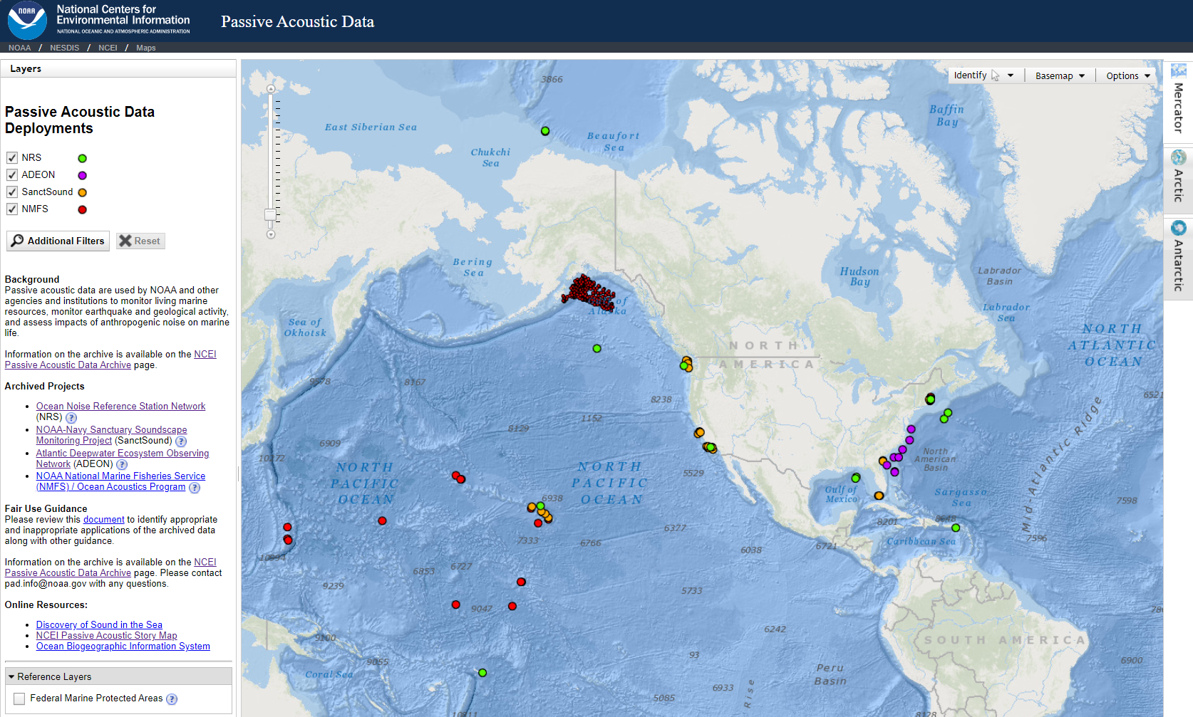
The NOAA National Centers for Environmental Information Passive Acoustic Data Archive manages and makes accessible data from SanctSound (orange circles) and other acoustic monitoring projects from around the country.
Sound can be described in a variety of different ways. Two key attributes of sound are intensity and frequency. Other attributes describe how the sound occurred over time: was it a short burst of sound or a long-lasting hum? Our measurements of “levels” of sounds summarize all these attributes: intensity, frequency, and duration.
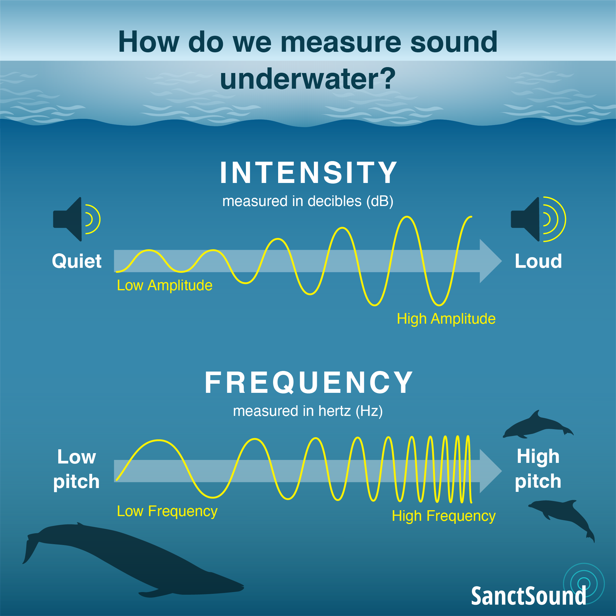
Intensity or “loudness” is measured in decibels and describes how much pressure the sound contains (the amplitude); a low decibel or quiet sound contains less amplitude than a high amplitude or loud sound. Frequency is measured in hertz and provides information about tones that are contained in a sound.
This web portal showcases the types of information that sound can provide to help us understand and protect our oceans and its inhabitants. Here you can explore acoustic features of each recording location with the U.S. National Marine Sanctuary System, and make comparisons among locations to better understand how similar or different they are from each other. To do this, we not only had to record sound information in a comparable way, we needed to make the same measurements from these recordings.
Spectrograms: Intensity of sound at different pitches over time
Sounds are visualized using a spectrogram. A spectrogram uses color to show the intensity (or loudness) of sound at various frequencies (or pitches) over time. Vertically you can see whether sound is more or less intense at different frequencies. Lower on the vertical axis are lower frequencies, higher on the vertical axis are higher frequencies. The composition of frequencies in the sound change as time advances from left to right on the horizontal axis.
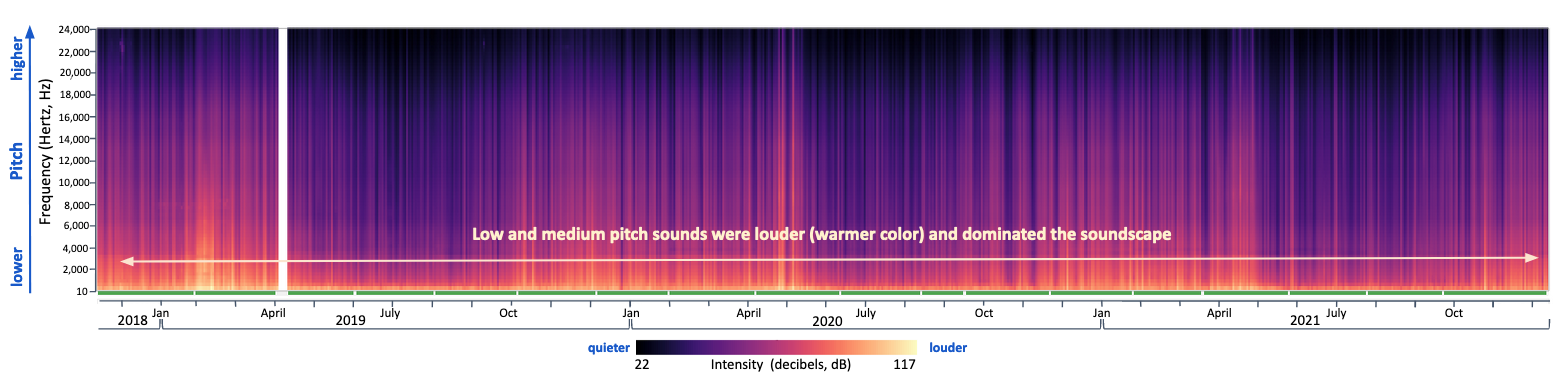
In this example spectrogram from a listening station in Stellwagen Bank National Marine Sanctuary, low and medium pitch sounds dominated the soundscape throughout the three year recording period (warmer colors at the bottom). Information about the quality of the sound data is included along the bottom of the plot with green indicating time periods of good quality data, yellow indicating periods with compromised data and data gaps shown with white. In the data portal, you can get more information about what frequencies of data are compromised during a time period by hovering over each yellow color bar.
Sound levels above median: Loudness and contribution of different pitches
For long-term (multiple year) measurement projects, it can be useful to identify what the average conditions are as well when conditions diverged from average. When conditions change, we can further examine whether that happened for all frequencies (pitches) of sound, or whether a specific range of frequencies drove those changes. We use a stacked histogram to summarize these departures from average over time all in one image.
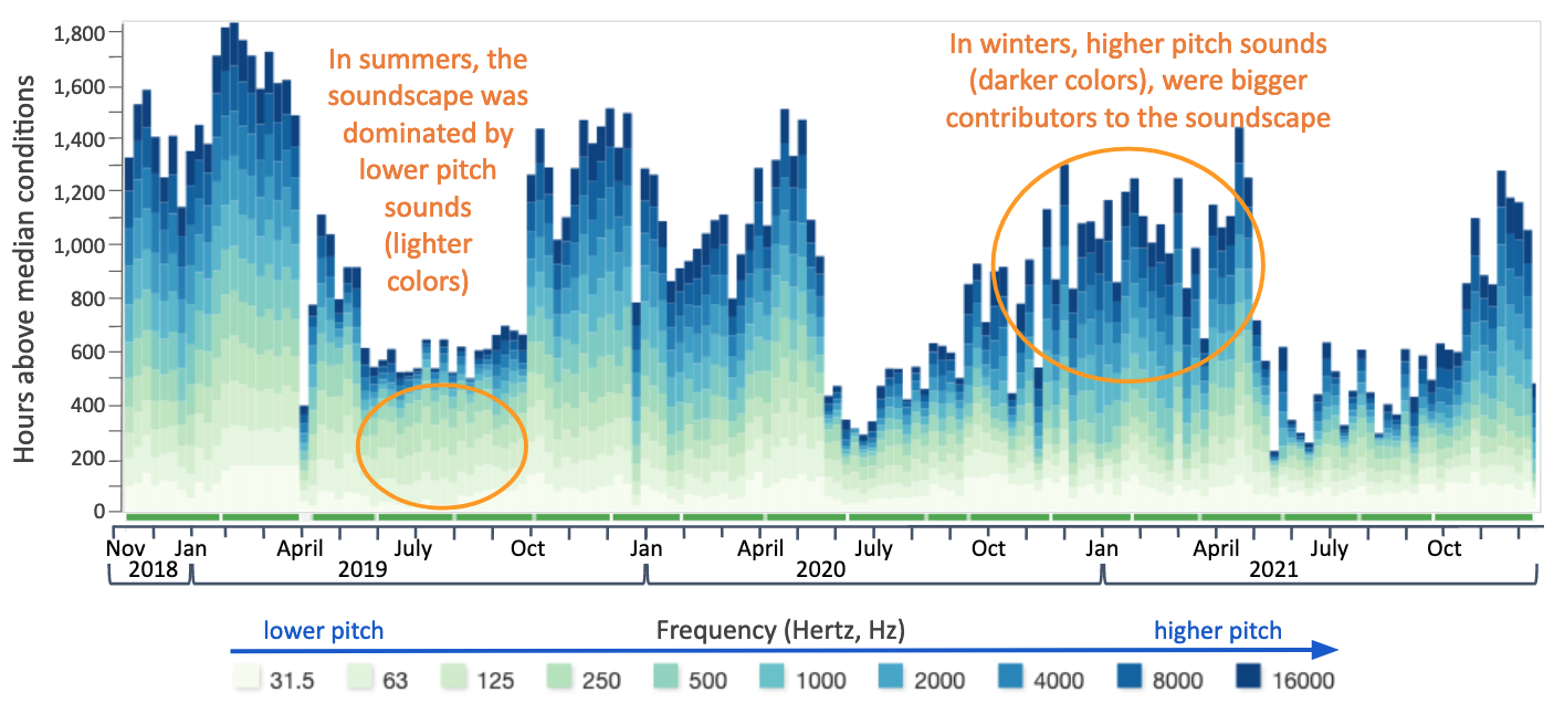
For example, in this histogram showing above-median sound levels for the same listening station in Stellwagen Bank National Marine Sanctuary there is a clear seasonal pattern, with some sound levels higher in the winter and early spring than in the summer months.
Power spectrum plots: Variability of loudness across pitches
When summarizing the soundscape of a location, power spectrum plots help us identify which frequencies (pitches) had the most sound intensity or loudness over the entire period of recording. The line in power spectrum plots shows the median loudness of sound at a specific frequency while the gray band shows the variability in loudness at that same frequency.
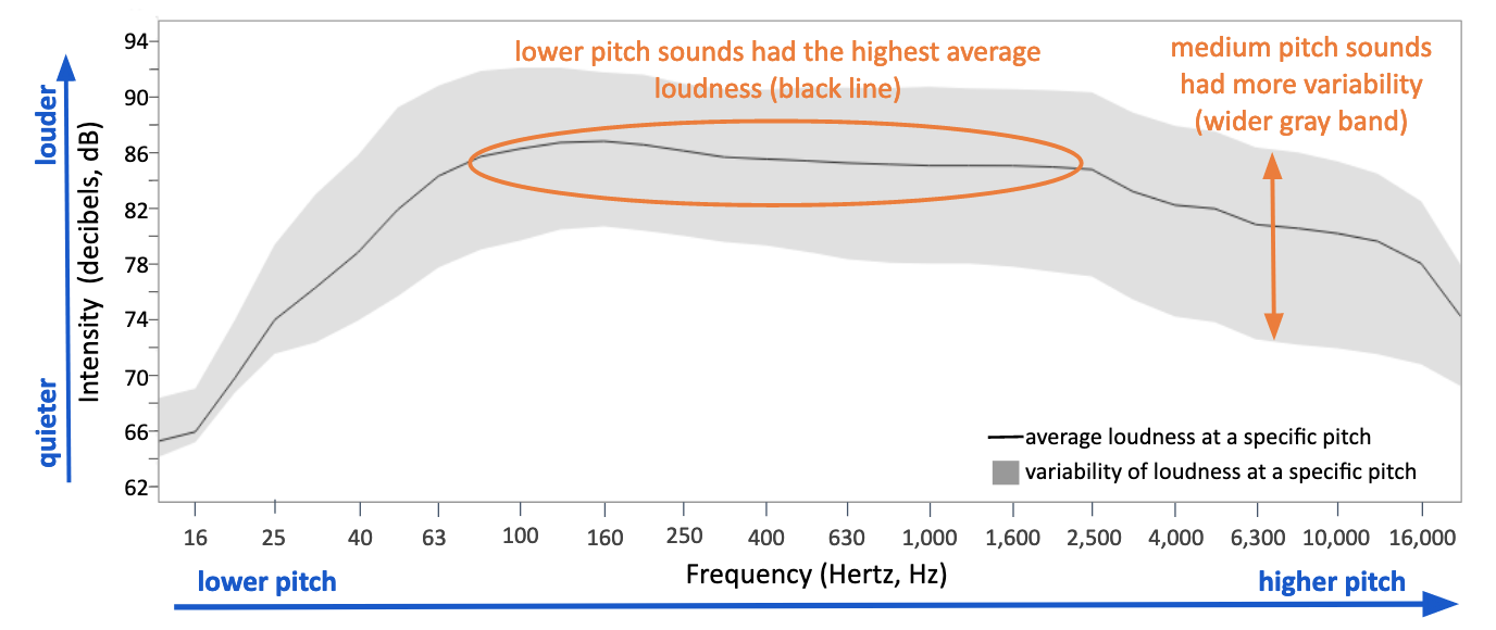
In this example plot for the same listening site at Stellwagen Bank National Marine Sanctuary, low pitched sounds (63-2,500 Hz) had the highest median intensities (black line) compared to other pitches. Across most pitches, sound levels were highly variable (wide gray band) due to weather events, vessel presence, and marine mammal vocal activity.
Anomaly plot: Deviation of loudness from average
To further visualize when loudness diverged from average during our recording period, we provide anomaly plots. For different frequencies (pitches) ranging from low to high, red shows when sounds of that frequency were louder than average while blue shows when they were quieter than average. White indicate times and frequencies that were close to averages.
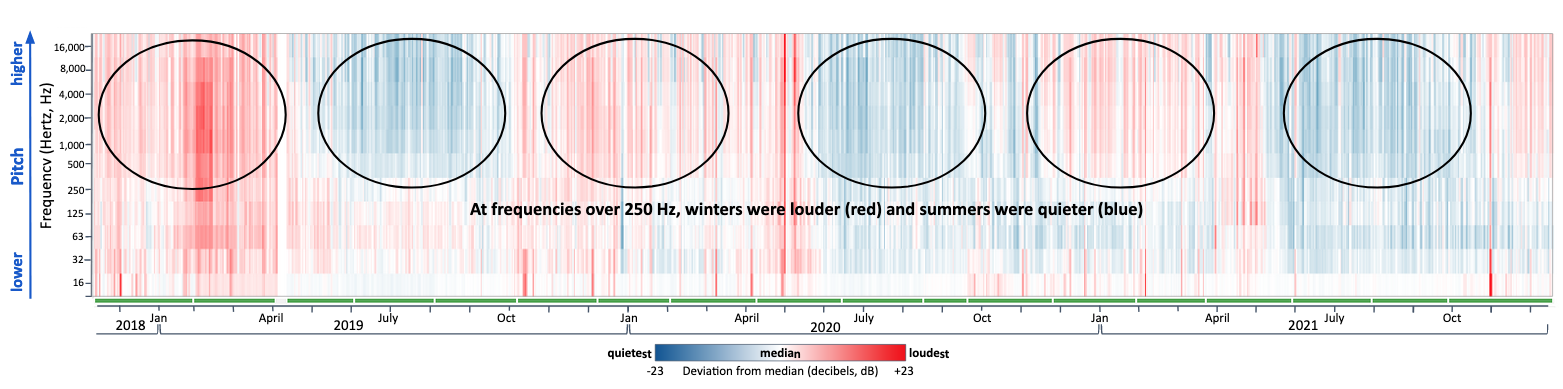
For the same listening site in Stellwagen Bank National Marine Sanctuary, we can see again the seasonal pattern noted in the stacked histogram. Here it is even clearer that frequencies of sound above 250 Hertz were generally higher in the winter than summer months.
Bringing it all together
These four ways of looking at sound levels recorded over long periods of time provide us with an initial idea of the patterns in a place’s soundscape. Taken together, they can help us dive deeper into the recordings to better understand the drivers for these conditions. These four plot types - spectrogram, stacked histogram, power spectrum and anomaly - are displayed under the ‘What did we measure’ tab for each sanctuary on the website. For those interested in exploring the variability in the levels of sound we recorded at a specific listening station or comparing levels among different listening stations in more detail, head to the SanctSound data portal using the ‘Data Portal’ pull down in the Navigation Bar.
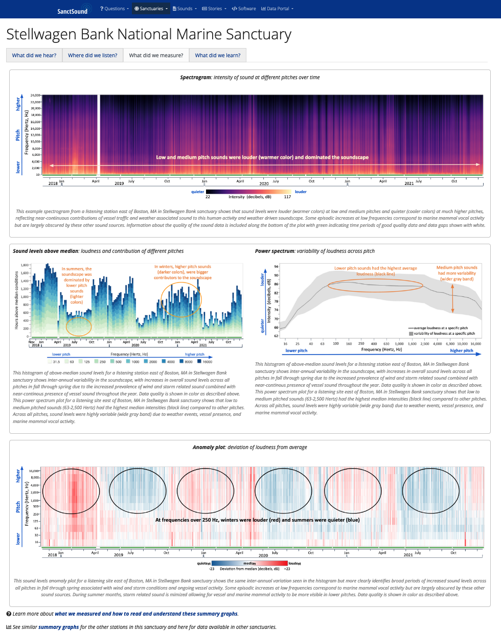
For example, looking across these plots for a listening site in Stellwagen Bank National Marine Sanctuary, we understand that this soundscape has predictably louder conditions at very low frequencies. A closer examination of vessel sounds shows us that vessels are almost always present at this location. Identification of other specific sources will help us understand the seasonal changes we see at slightly higher frequencies. During the late fall to early spring months, several populations of fish and baleen whales produce calls at this sanctuary location.