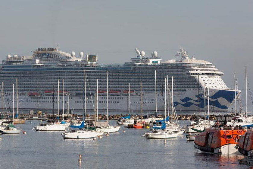
Monterey Bay National Marine Sanctuary
What did we hear?
Click the icons in the scene below to listen and learn about the sounds we recorded in this sanctuary.
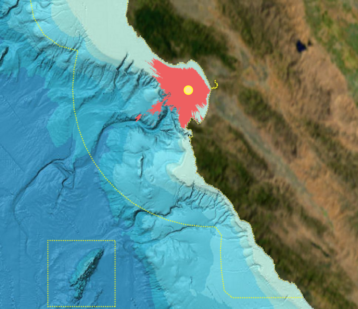
Where did we listen?
Here is a map of listening device locations. Hover on a location to see its site id and click on it to see the rationale for its placement.
Learn more about how we
listened to and recorded
soundscapes.
See similar maps
of the listening range for the other hydrophones in this
and in other sanctuaries.
What did we measure?
Spectrogram: intensity of sound at different pitches over time
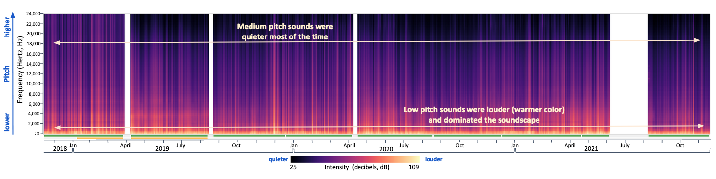
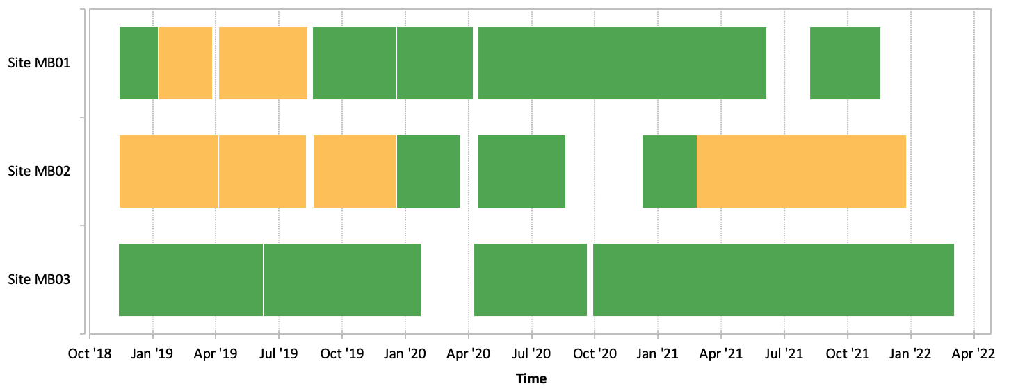
This example spectrogram from a listening station on the edge of Monterey Canyon in Monterey Bay sanctuary shows that sound levels were generally louder (warmer colors) at low pitches and quieter (cooler colors) at medium and high pitches, likely reflecting contributions of local vessel traffic in and out of the nearby Monterey Harbor, wind and waves, as well as biologics such as baleen whales and fish. Information about the quality of the sound data is included along the bottom of the plot with green indicating time periods of good quality data, yellow indicating periods with compromised data, and data gaps shown with white. In the data portal, you can get more information about what frequencies of data are compromised during a time period by hovering over each yellow color bar.
Sound levels above median: loudness and contribution of different pitches
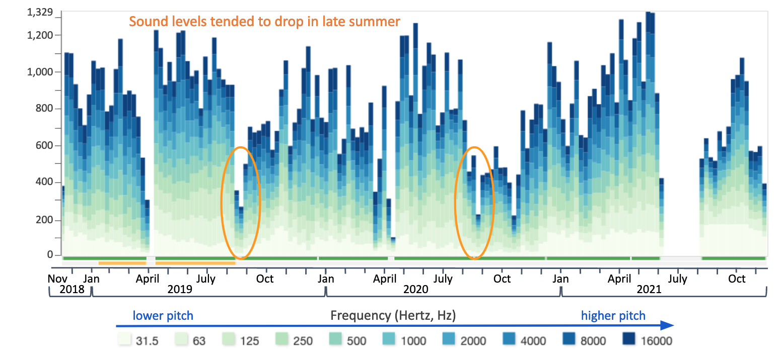
This histogram of above-median sound levels for the Monterey Canyon listening station in Monterey Bay sanctuary shows seasonal variability in the soundscape, with drastic drops in sound levels in spring (~March) and late summer (~Aug) of all years sampled. Data quality is shown in color as described above.
Power spectrum: variability of loudness across pitch
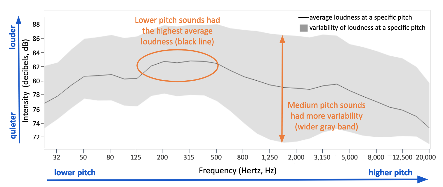
This power spectrum plot for the Monterey Canyon listening site in Monterey Bay sanctuary shows that lower pitched sounds (125-500 Hertz) had the highest median intensities (black line). Sounds with frequencies above 500 Hertz were more variable over time (wider gray band) at this site.
Anomaly plot: deviation of loudness from average
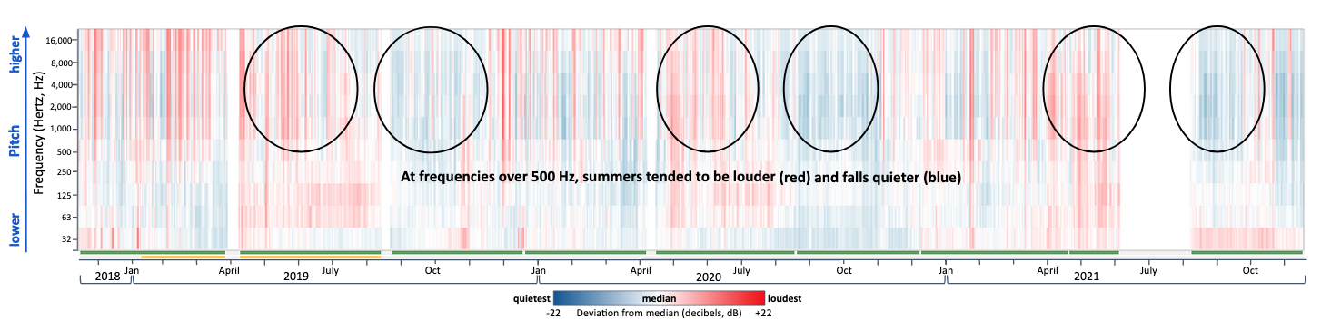
This sound levels anomaly plot for the Monterey Canyon listening site in Monterey Bay sanctuary shows the same seasonal variation seen in the histogram but more clearly identifies the pitches of sound (>500 Hertz) that were higher than the median (shades of red) just after early spring reductions (~March, shades of blue) in sound levels. Similar spikes are noticable in months following reductions in late summer/fall sound levels. Data quality is shown in color as described above.
Learn more about what we measured and how to read and understand these summary graphs.
See similar summary graphs for the other stations in this sanctuary and here for data available in other sanctuaries.